

How Color Shows Up in a Mountain Home (Even If You Never Touch a Paintbrush)
There’s this hesitation I see a lot, especially in the hills.
People want their space to feel warmer, more like them, but color feels like a decision you can’t undo. Like once it’s there, you’re stuck living with it through foggy mornings, long winters, and those slow, quiet afternoons when everything feels a little more noticeable.
And sure, sometimes people do get it wrong. But it’s never as permanent as it feels in your head. It’s usually just a weekend and a little patience to shift things back.
What’s easier to forget is how much color changes a space without asking much from you. Especially up here, where the light moves differently through the trees and everything already leans a little earthy and muted, even a small shift can make a room feel entirely different.
And color doesn’t have to mean bold. Around here, it usually doesn’t.
Neutrals are still part of the story. The soft whites that pick up the morning light in Ben Lomond, the warm wood tones you see in Boulder Creek cabins, the sandy beiges that feel right at home in Aptos. It all counts.
So if you’ve been wanting to bring in a little more life without committing to a full repaint, here’s where it tends to happen naturally.
Where Color Slips In Without Trying Too Hard
Start small. That’s usually how it works anyway.
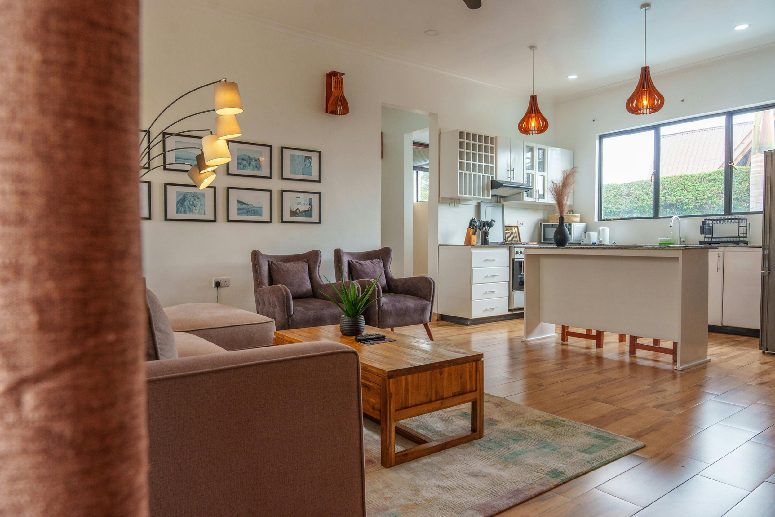
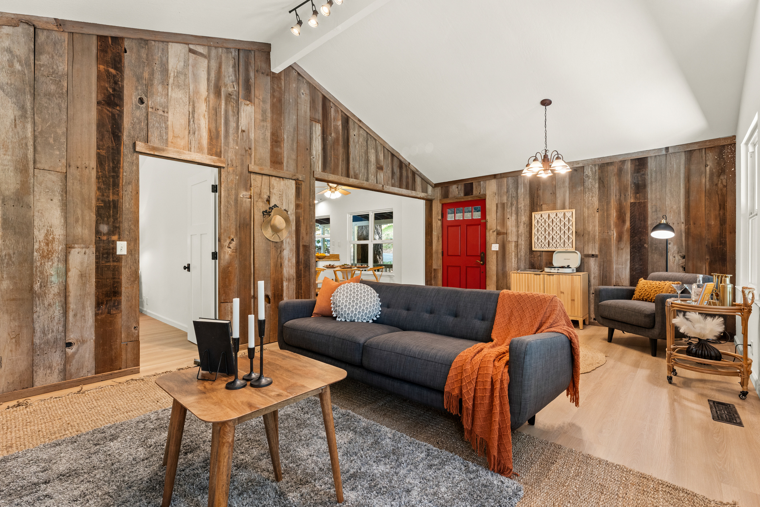
Textiles are the easiest shift. A couple of throw pillows on the couch, something with a little texture, maybe a color that echoes what’s outside your window. A blanket tossed over the arm of a chair that you actually use on colder nights. Even curtains can change the whole feeling of a room when the light hits them in the afternoon.
Art tends to do more than people expect. A single piece above the couch, something you picked up in Santa Cruz or found tucked into a small shop in Felton, can quietly anchor everything else. It doesn’t have to match. It just has to feel like you didn’t overthink it.
Plants almost don’t count as decorating, but they shift a space anyway. A few at different heights, maybe one near the window, one on a shelf, one you keep forgetting to water but somehow survives. Even the pots can carry color without it feeling forced.
Rugs do a lot of quiet work. Especially in older mountain homes where floors aren’t always perfect. Swapping out something flat and neutral for a rug with a little pattern or warmth can make the whole room feel more settled. It doesn’t have to be loud. Just not forgettable.
Then there are the smaller things. A side table you painted one rainy weekend. A lamp with a shade that feels slightly different from what you’d normally choose. A stack of books on a shelf that accidentally turned into a color story without you planning it.
It’s never just one thing. It’s usually a few small choices repeating themselves in a way that feels unintentional but isn’t.
The Colors That Keep Showing Up This Spring
You start noticing patterns after a while. Walking into homes around Scotts Valley or Capitola, or even just paying attention to what people are bringing back from local shops, certain tones keep repeating.
Warm Apricot
It shows up softly at first. In ceramics, in pillows, in a piece of art that catches the late afternoon light just right.
There’s something about it that works with the redwood tones. It doesn’t fight the space, it just warms it up a little. You’ll see it in small ways most often, something on a coffee table, a lamp, maybe a chair if someone’s feeling a little braver.
It pairs easily with what’s already here. Creamy whites, worn wood, a bit of green from outside. Nothing feels out of place.
Deep Olive
This one almost feels like it belongs to the mountains already.
You see it in kitchens, sometimes on cabinets, sometimes just in a set of linen curtains. It shows up in blankets, in rugs, in those small details that make a room feel grounded.
It works because it doesn’t try to stand out. It blends into the environment in a way that feels calm, especially in homes surrounded by trees. On foggy mornings, it almost disappears in the best way.
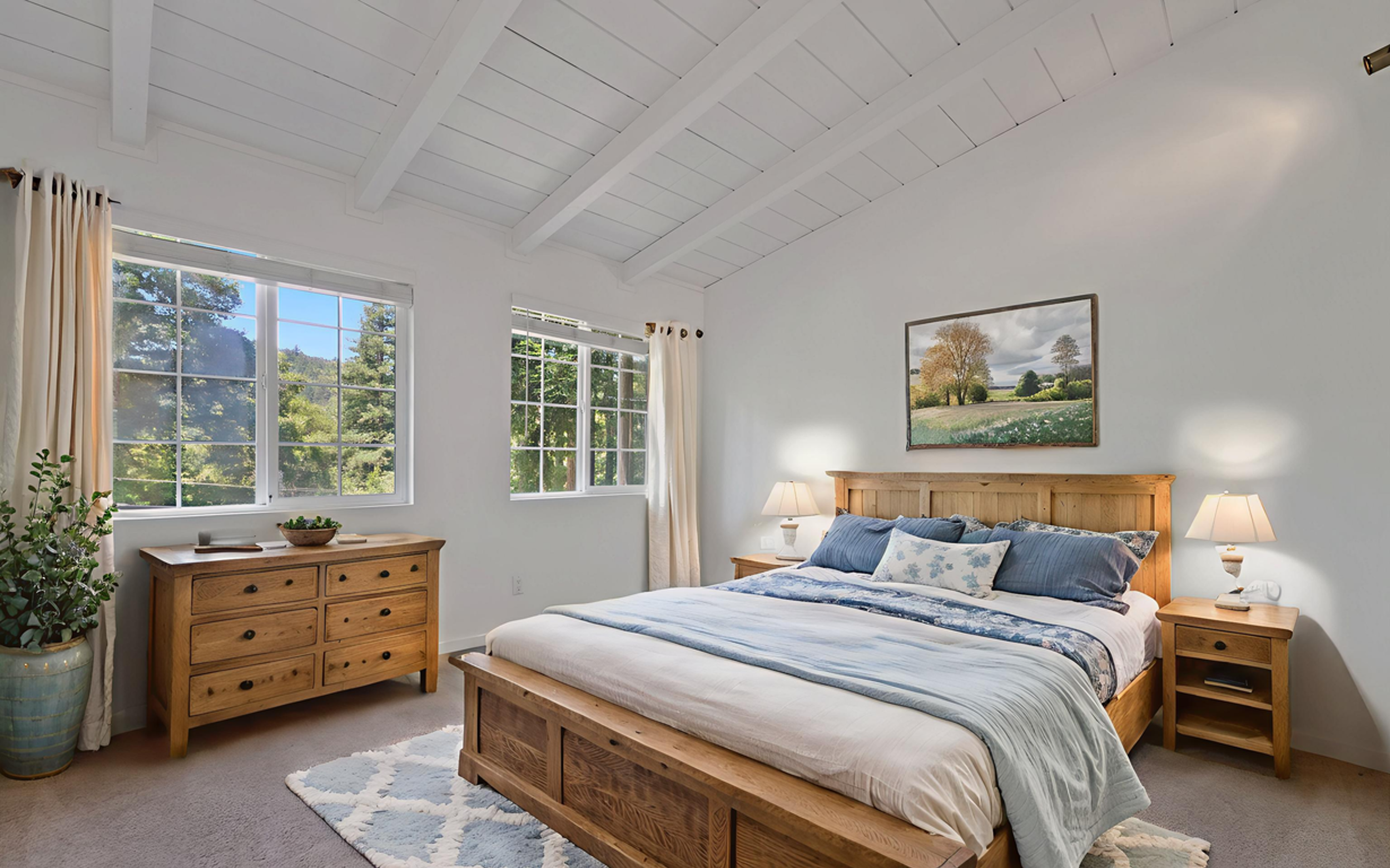
Soft Periwinkle
This one feels a little unexpected up here, but it keeps appearing.
Not bold, not bright. More like something you’d notice in the sky right before the sun burns through the fog. It shows up in bedrooms a lot, or in bathrooms where the light is softer.
There’s something slightly nostalgic about it, but it doesn’t feel dated. Just lighter. A quiet contrast to all the deeper tones that tend to dominate mountain homes.
Letting It Happen Slowly
Most homes up here don’t come together all at once.
They shift over time. A chair gets moved. A blanket gets replaced. Something new gets added after a weekend in town. Color usually finds its way in the same way.
Not as a big decision. More like a series of small ones that start to reflect how you actually live in the space.
And that’s usually when it feels right. When it doesn’t look styled or finished, just lived in.
You don’t need to change everything. Just enough that when you walk in at the end of the day, it feels like yours.
Follow along:
📍Follow me on Instagram @heysarahwagner for more Santa Cruz Mountains tips and ideas.
📍Thinking about buying or selling in Santa Cruz Mountains? Let’s find a home with a great bones ( so you can add the color). Contact me here!